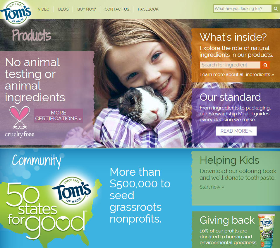
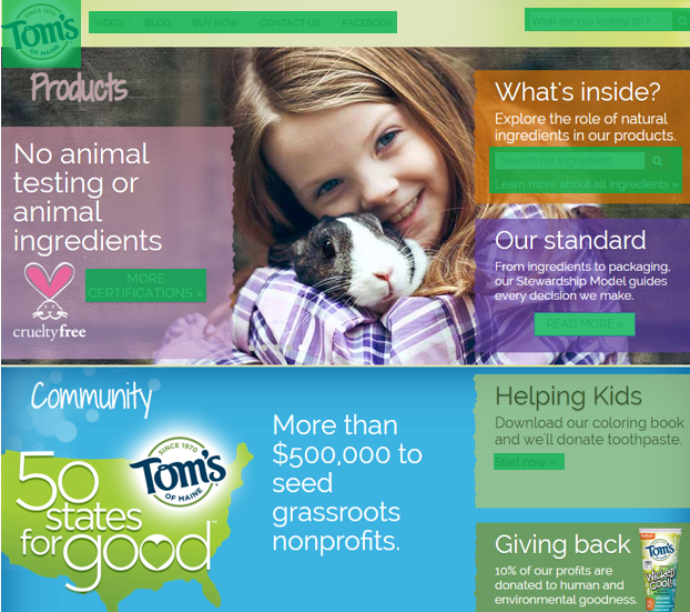
When making clickable elements for your website you want to make it clear to your visitors what they can and cannot click on in your site. Take for example the homepage for Tom's of Maine Below I have two images, the one on the left is the homepage, while the one on the left emphasizes what is a clickable element on the homepage, is it clear which elements are clickable and which are not? Not really, and although their homepage looks much better now, there was a time when they committed a Don't in web design that we learned about in our required reading.


How can framing a project into a story format help me refine my ideas? This was the question asked to me after reading the required reading Better User Experience Through Storytelling and after I finished the article I knew exactly how it could help me. I learned that all people have an innate sense of what the hero's journey is, it's what makes us as people empathize with characters we read about or see on a screen in movies. Well what about other forms of media? Are you able to empathize with an app on your phone? With a website on your computer? Well with good design, the answer can be yes. Good UI designers make the visitor to their site feel emotionally engaged to their pages as well as mentally engaged. If you frame your site as a story your users will be more engaged as they are more involved emotionally, they can see themselves in a site's mission, or even the color scheme used and aesthetic of the page, it's all about making your site more 'human' so that your users can relate on a deeper level. Overall following a story format in any project you're doing will help you have a cohesive idea that the page will follow, as well as make it easier for users to feel personally involved with.
When creating your webpage there may be certain words or heading you want your visitor to see first, what are some ways to make sure those get seen first? Below are some ways to establish a hierarchy in your fonts:
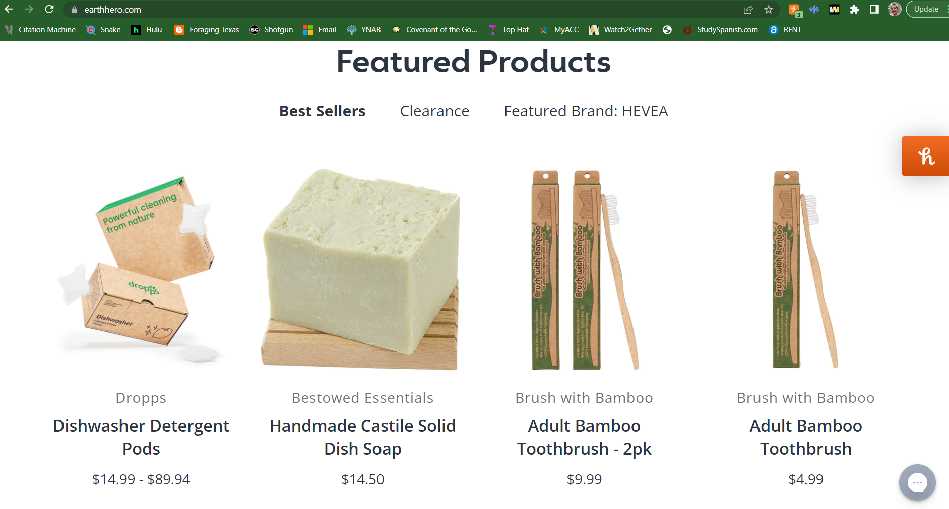
One website that has a good use of Heirarchy is Earthhero.com which I frequent quite a bit. I've included a screenshot of their homepage as you can see a noticeable difference in the size and weight of the text that draws your eye to different parts of the page.
Young people nowadays want to be fashionable and keep up with the latest trends but this also creates the issue of fast fashion, large companies producing a large amount of one style of clothing for as little as a month, and after it goes out of style all of those clothes produced go to landfills creating more waste on our planet.
Young people who want care about fashion and their appearance, as well as the planet and want to make a personal change in how much waste they contribute to on this planet.
There are two different types of competition that I forsee, the large companies that are creating fast fashion, companies like shein, forever 21, even target, any clothing chain that mass produces clothes just to throw them out in a month of so. The second competition I can think of is sites that are like myself and want to cut down on fast fashion, where reselling clothes is common, sites like ebay, depop, while we have a common goal, they are also my competition.
I want to portray to the user that I care about the environment and want to create an affordable site where others can share their love for thrifting and share creative diy's, my message is that you don't have to spend a lot of money to be fashionable and you don't have to buy new to be fashionable.
I want to encourage users to buy and sell clothes with each other and create a community where people share their creative DIY ideas to help lower the amount of fast fashion that's circulating. Don't you want to save our planet? Don't you want to look cute while doing it?
The best way to measure success for my site would be to see the revenue firstly, how much people are visiting the site and using the resources on it, and second would be to see how much people are making their own content on it, more than anything I want people to feel free to use my site as a tool to find and share cool new ideas on how they think fashion should be, and how it should be green and eco-friendly.